Smarter Search
Rebuilding how analysts find intelligence.

Overview
Search is the primary way analysts access Seerist’s intelligence, from breaking events and risk signals to deeper research.
The challenge was designing one Search experience for very different levels of intent, from operations teams looking for a quick answer to analysts building complex investigations.
- Sole Search designer, from discovery through implementation
- Oct 2025 to Jul 2026
- 2 Product Managers, 10 Engineers, 7 Customer Success Managers
Outcome
40%↑
Time to relevant intelligence
Product analytics, pre/post launch
20%↓
Interactions to complete Search tasks
Product analytics, pre/post launch
4/5
Ease of finding relevant information
Post-task rating, around 20 participants
Try it
The problem
Search reflected Seerist’s structure more than the user’s workflow.
That made Search slower and harder to navigate as investigations grew, often requiring Customer Success to help users build and share searches.

Before: Search as it existed, and the way analysts reached everything through it.
The core issues
- Powerful tools hard to discover
- Terminology and system feedback unclear
- Organized around the system rather than how users investigated
- Complex searches harder to build and follow
The business case
Complexity was creating work inside and outside the product.
As searches became more advanced, Customer Success regularly used customer calls to help build queries and share them back. A core product workflow was becoming an ongoing support task.
The opportunity was not simply to make Search easier. It was to help more customers use the power of Search independently while preserving the depth expert analysts needed.
Research
Understanding the user
Analysts arrive with questions, not queries.
Security, risk, operations, and intelligence teams work with incomplete information that changes constantly.
They rarely arrive thinking about filters or Boolean logic. They arrive with a question.
Detect what is happening
Operations and security teams
“What is happening around my assets?”
Understand the bigger picture
Risk and security analysts
“Is this situation becoming a risk?”
Explore emerging threats
Research and intelligence analysts
“What should we be watching?”


These workflows required different levels of speed, flexibility, and control, but all lived inside the same Search experience.
What research changed
We entered discovery with a long list of pain points and feature ideas. Research revealed a common pattern:
Users had to understand too much about Seerist before they could search effectively.
At the same time, users relied heavily on the visual keyword builder because it gave them structure for creating more sophisticated searches.
Key design decisions
- 01
Make complex filtering understandable
Filtering became the hardest design problem in Search.
There were 25+ ways to refine intelligence. Exposing everything created noise, while hiding too much made expert workflows slower.
My approach was progressive.
- Common filters such as Location, Date, and Content Type stayed immediately accessible.
- Deeper filters were organized by data type behind Add filters.
- Applied criteria remained visible as users refined the Search.
Engineering explored a more compact filter model, but it blurred the hierarchy between filter types.
I advocated for a clearer model that made categories and Search capabilities explicit, building on research showing users were already overwhelmed by Search’s complexity.
Decision: Make the system’s capabilities explicit.
Why: Users shouldn’t have to infer what they can do. Clear hierarchy helps them understand the system at a glance.
The team went with the more explicit approach.

Before: All filters exposed, options harder to find. 
After: Key filters surfaced, the rest in one menu. Consolidating Location
The same principle applied to geographic filtering. Location options had been spread across 7+ menus. I brought them into one Location control so users could search across geographies and assets without knowing where Seerist stored each type.

Before: Location filters spread across 7+ menus 
After: Location filters consolidated into one control Users should know what they want to find, not where the product put it.
- 02
Make advanced Search easier to build
Search needed to support both simple queries and highly specific investigations.
Raw Boolean syntax gave experts control, but required specialized knowledge. The visual keyword builder moved that complexity into the interface.
Users could:
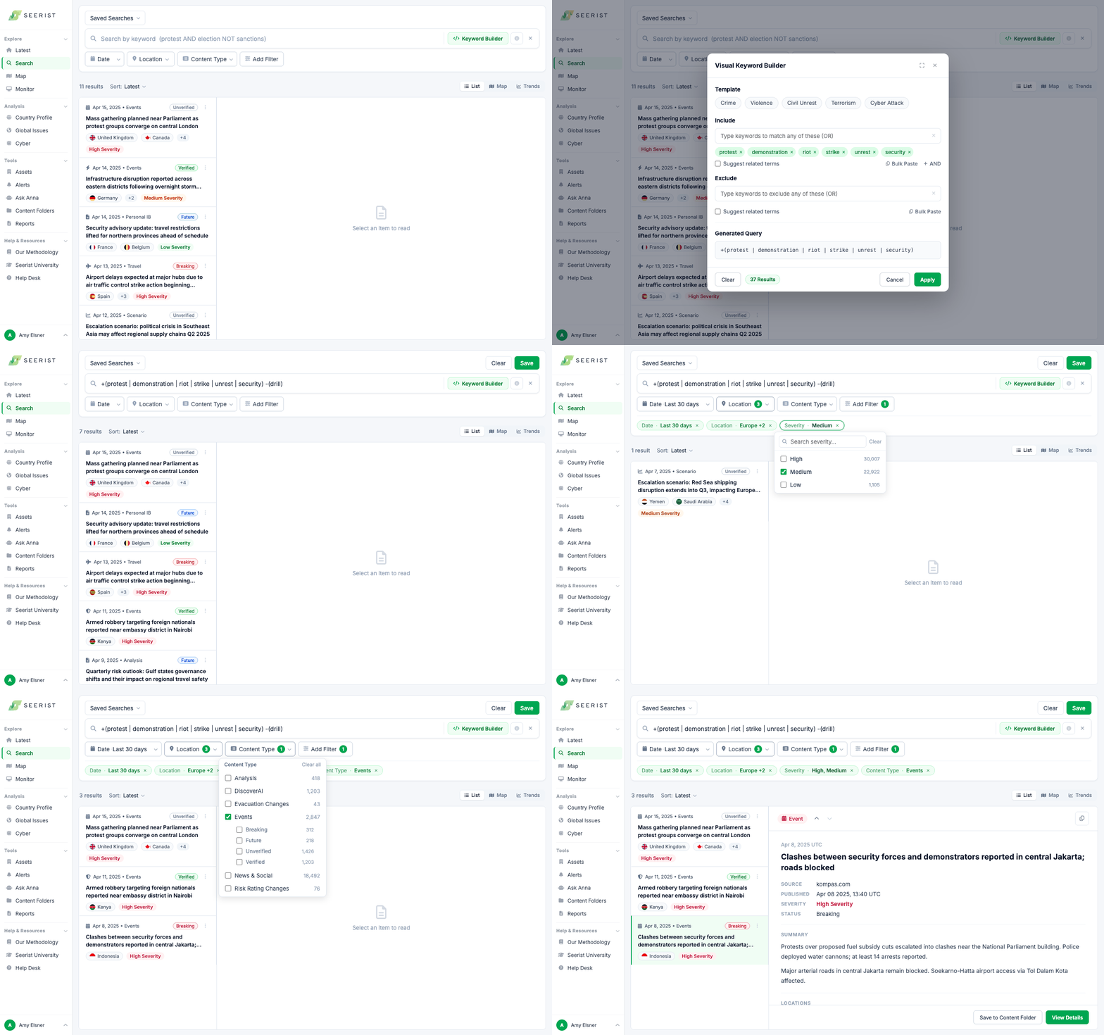
- Add Include and Exclude terms
- Build logical groups
- Bulk paste large keyword sets
- Use templates as a starting point
- See the structure of the query as it grew
This gave analysts more control without requiring them to learn the underlying query syntax.

Include and exclude terms as chips, and the Boolean they write. - 03
Make it easier to start and return
Search often began from a blank state even when users repeated the same work.
I looked for places where the product could carry more of that setup for them.
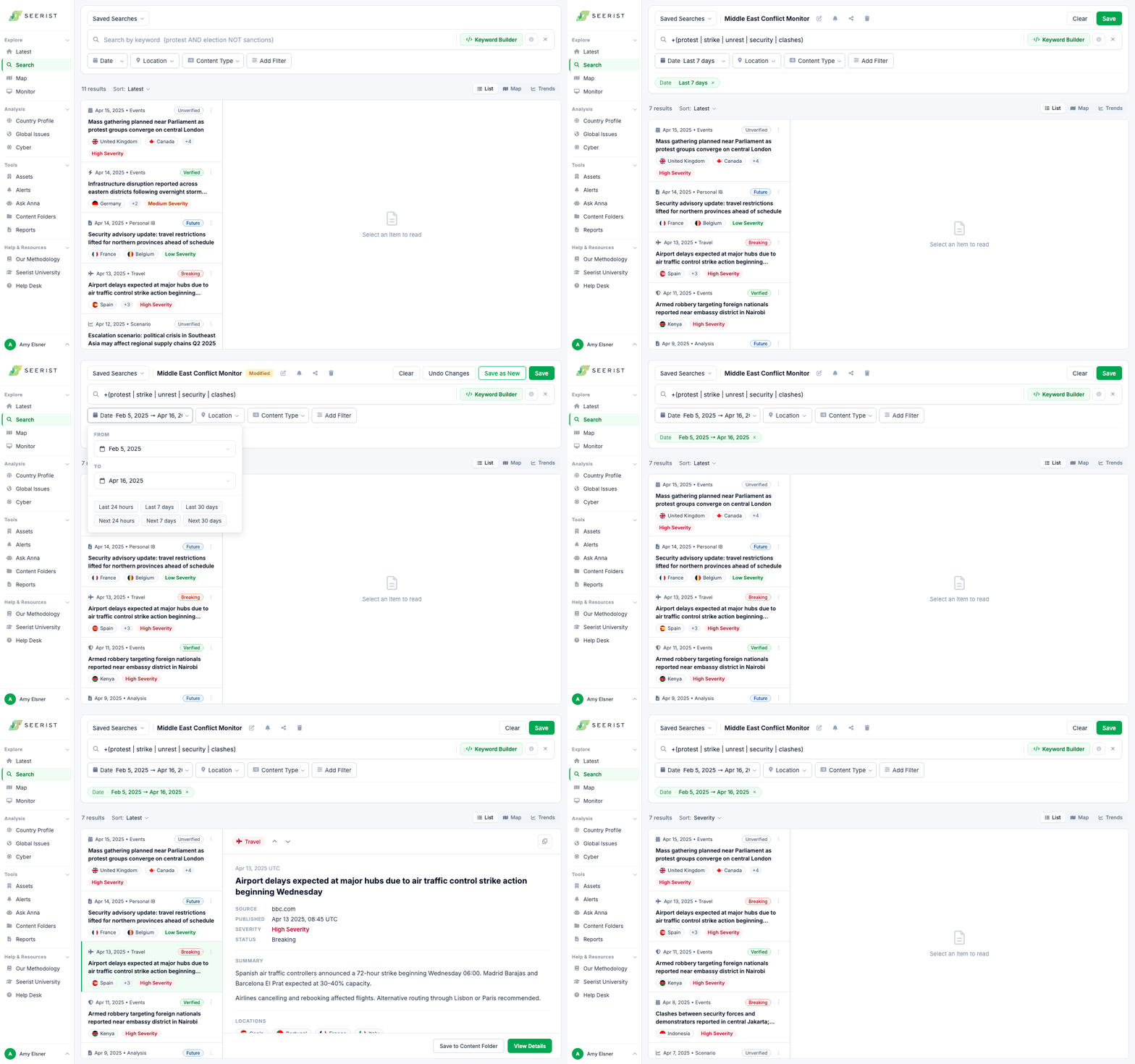
- I surfaced saved searches so analysts could return to previous investigations without reconstructing them.
- Common time ranges reduced repetitive filtering decisions.

The Saved Search library, surfaced in Search 
Quick ranges beside the date filter. I explored quick links as a shortcut into common searches. Research showed that the placement and wording created another choice before users could begin. I removed it.
- 04
Make Search explain itself
In a complex Search experience, small ambiguities compound quickly.
I made system behavior more explicit through interaction and language.
Before After Filter menu Advanced Filter Add filters. Describes the action rather than the system concept. Map control Map extent Search This Area. Connects the control to what the analyst is trying to do. Result count 10,000 results 10,000+ results. Makes the system limit visible instead of presenting a capped number as exact.
What testing changed
- The search bar gained more space, for analysts who type or paste a query directly.
- Quick links to other pages caused confusion without earning their place, and were removed.
- The Select Card button came out, replaced by select on hover, so actions live on the card itself.
- Toggling between the keyword builder and the search bar without losing work was prioritized into the MVP.
Final design
Different entry points. One connected Search workflow.
Users could begin with what they already knew and add precision as the investigation developed.
Search flow
Saved search flow
MVP and tradeoffs
Preserve continuity. Fix what blocked the core workflow.
This was a migration of a product customers already depended on. We needed to preserve established workflows while using the rebuild to address the areas creating the most friction.
I also explored denser result layouts and stronger matched term highlighting. Those ideas stayed secondary while we focused on getting the core Search model right.
Impact
“Much more intuitive than the previous version. You can tell it was built for how we actually work.”
“I had no idea the search library was here. This would have saved me so much time, I just ran a search last week where I needed exactly this.”
“The new keyword search is so much faster. The old one was confusing, this actually makes sense.”
One customer recognized that feedback they had previously shared had made its way into the final product. That closed an important loop for me.
Reflection
I learned to turn ambiguity and competing opinions into clear tradeoffs the team can make a decision around.
What I shaped
Across Product, Engineering, Customer Success, and Design, there were different assumptions about what users needed and how much complexity the interface should expose. I brought user behavior into those decisions, created alternatives when a direction was unclear, pushed when an implementation weakened the experience, and changed my own ideas when research showed a better path.
What I’d focus on next
Protect the context analysts build.
- 01
Saved filter views
Let analysts return directly to a preferred filter configuration.
- 02
Recent Searches
Make frequently repeated searches immediately accessible without requiring users to find or rebuild them.